What Does a Mobile-First Web Design Look Like?
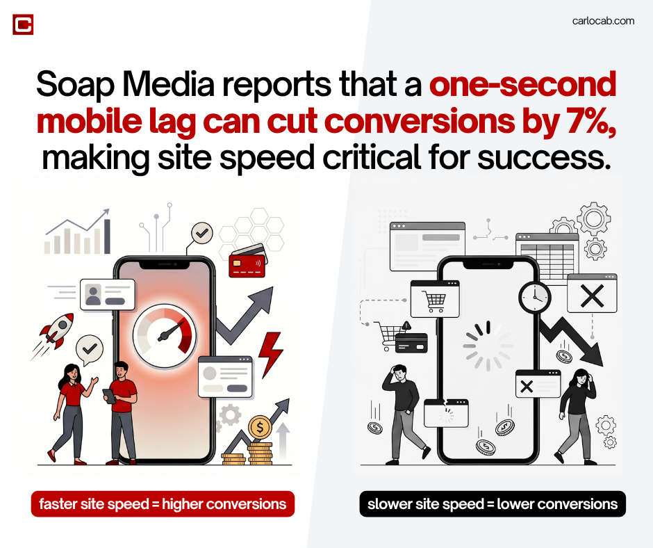
A mobile-first web design appears as a streamlined, vertical layout characterized by large touch-friendly buttons, simplified navigation menus, and prioritized core content that fits seamlessly on a 6-inch screen. According to Integrove (2026), this approach is a functional necessity as mobile devices now account for the majority of global web traffic. This design philosophy emphasizes technical efficiency, focusing on rapid load speeds to prevent user abandonment. In relation, research from Soap Media indicates that even a one-second delay in mobile loading can reduce conversions by 7%, making performance-based architecture a critical baseline for modern digital infrastructure.
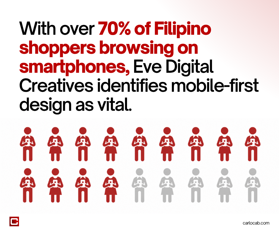
By starting with the smallest screen, designers utilize a strategy known as “progressive enhancement,” ensuring that essential features work perfectly on low-bandwidth connections before adding complexity for desktops (E-SPIN, 2026). In the local context, Eve Digital Creatives highlights that this design framework is vital for the Philippine market, where over 70% of online shoppers browse primarily via smartphones.
Furthermore, Syntactics Inc. notes that businesses adopting mobile-first structures see significantly higher e-commerce engagement, as Google’s mobile-first indexing now prioritizes these optimized sites in search rankings, directly influencing a brand’s visibility and long-term profitability (WebRocket, 2025).
The 2026 Gold Standard: Why Responsive Web Design is Non-Negotiable in the Philippines
In 2026, the Philippine digital market has transitioned from mobile-friendliness being a luxury to responsive infrastructure being a mandatory business requirement. The country’s unique digital landscape—defined by a mobile-first population and fluctuating connectivity—demands a “Progressive Enhancement” strategy. As noted by E-SPIN (2026), this approach ensures that websites remain functional on basic mobile devices before scaling up for high-end desktops. For local brands, ignoring this is no longer just a design flaw; it is a direct threat to market share.
The Shift to a Mobile-Only Reality
The Philippines has long been dubbed as the “Social Media Capital of the World,” but recent data shows a deeper structural shift toward a mobile-only demographic. Eve Digital Creatives reports that over 70% of online shoppers in the country now browse and complete transactions exclusively via smartphones. This behavior is fueled by the prevalence of “Super Apps” and local e-wallets, which have integrated seamlessly into the daily lives of Filipinos. And when a website fails to provide basic responsive experience, it creates a digital wall that alienates a majority of the local consumer base.
Connectivity and Technical Performance
Despite the expansion of 5G networks in urban centers like Manila and Cebu, internet speeds remain inconsistent across the 7,641 islands. However, responsive web design tries to address this by optimizing how data is delivered. Soap Media emphasizes that mobile-first architecture prioritizes lightweight assets and efficient coding, which is critical for users on limited data plans or unstable connections. A non-negotiable standard in 2026 is the ability for a site to load core elements instantly, as even a minor lag can lead to immediate bounce-backs in a highly competitive local market.
Google’s Search Algorithm Ranking Factors
From a technical SEO perspective, the gold standard is enforced by Google’s full-scale, mobile-first indexing. WebRocket (2025) highlights that Google’s crawlers now evaluate the mobile version of a Philippine website to determine its ranking for both mobile and desktop searches. If the responsive infrastructure is lacking, the site’s visibility in Search Engine Results Pages (SERPs) will plummet, regardless of how well the desktop version performs.
Trust as a Digital Currency
Ultimately, responsiveness is a signal of brand authority. WowVisible points out that in the Philippine digital economy, a broken or “zoomed-out” mobile layout is viewed as a lack of professional credibility. For local brands, a responsive site serves as a 24/7 digital storefront that builds trust through accessibility. By adopting this gold standard, businesses ensure they are reachable by every Filipino, regardless of their device or location, solidifying their place in the 2026 digital frontier.
Advantages of Optimizing a Mobile-First Web Design
Optimizing for a mobile-first architecture provides local brands with a distinct competitive advantage by aligning technical performance with actual user behavior. Beyond mere aesthetics, this strategy focuses on lean infrastructure and high-utility features that drive measurable business outcomes.
Enhanced Conversion Rates and E-commerce Growth
A primary advantage of mobile-first optimization is the direct impact on revenue. According to Syntactics Inc., businesses that prioritize mobile-first structures experience significantly higher e-commerce engagement and sales. By simplifying the path to purchase—using larger touch targets and streamlined checkout flows—brands reduce the friction that often leads to abandoned carts. Research indicates that when a mobile interface is intuitive, users are more likely to complete high-value actions without switching to a desktop.
Superior Load Speeds and Performance
Speed is the cornerstone of the mobile experience. Mobile-first design utilizes progressive enhancement that ensures that important content loads first before heavier decorative elements are introduced (E-SPIN, 2026). Soap Media reports that optimizing for speed is critical, as a one-second delay in mobile load times can result in a 7% reduction in conversions. In the Philippines, where data costs and connection speeds vary, a fast-loading, optimized site ensures that brands do not lose potential customers to technical latency.
Cost-Efficiency and Simplified Maintenance
Maintaining a single responsive codebase is far more efficient than managing separate entities for mobile and desktop. A unified responsive design is reported to reduce long-term development and maintenance costs (Varrela, 2015). And for local SMEs, this means marketing budgets can be directed toward content and growth rather than fixing compatibility issues across different device models.
Improved User Retention and Lower Bounce Rates
When a website is optimized for mobile, it naturally caters to the on-the-go nature of modern browsing. Data from ResearchGate on traffic analysis reveals that responsive websites maintain significantly lower bounce rates. By providing a consistent and stable visual experience, like avoiding the visual instability often found in non-optimized sites, brands can keep users engaged for longer periods. This stability is essential for building long-term brand loyalty in the 2026 digital economy, where user attention is a highly contested resource (Integrove, 2026).
Integrating SEO and Social Media Marketing with Mobile-First Web Design
In the Philippine digital landscape, a website does not exist in a vacuum; it serves as the destination for a complex ecosystem of search queries and social discovery. Integrating mobile-first design with SEO Philippines and social media marketing ensures a frictionless journey from a user’s feed to a brand’s conversion page.
The Teamwork Between Mobile Design and SEO
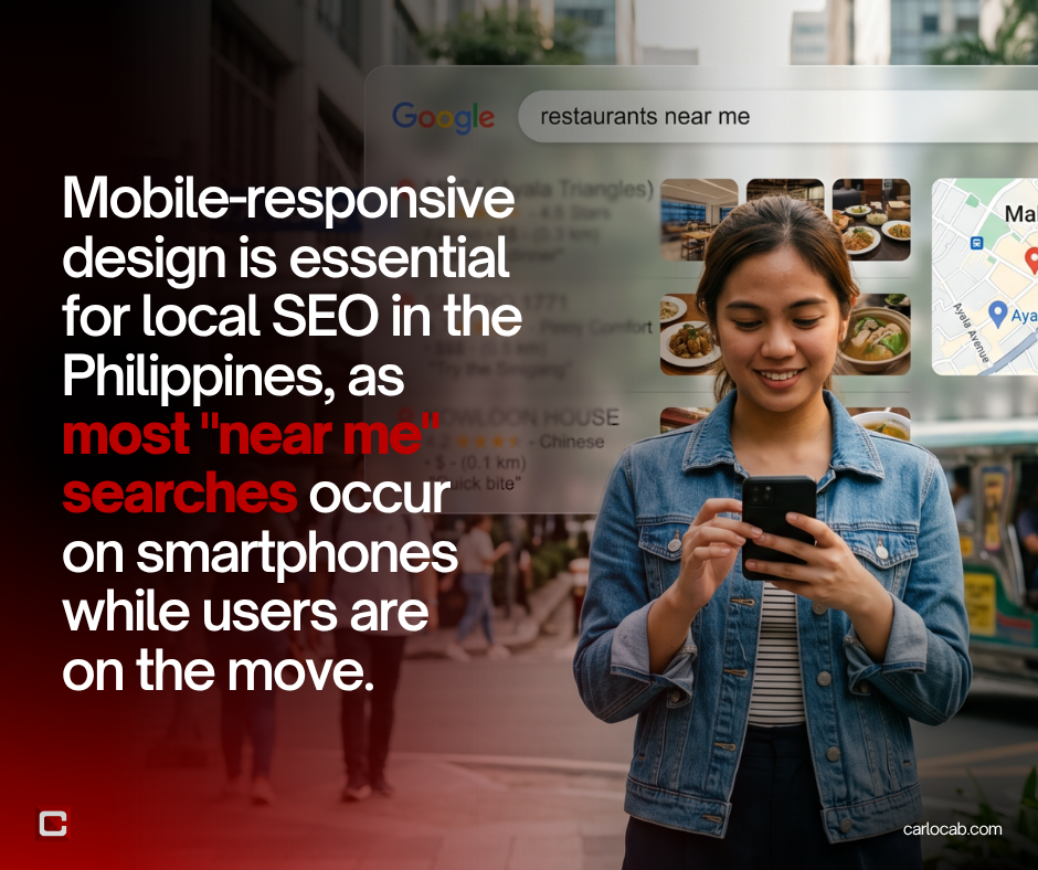
Google’s shift to mobile-first indexing means that the mobile version of a site is not the primary source of ranking and indexing (WebRocket, 2025). A mobile-first architecture naturally supports technical SEO by improving core website details, such as loading performance and visual stability. Plus, Eve Digital Creatives notes that mobile-responsiveness designs are critical for local SEO too, as most “near me” searches in the Philippines are done via smartphones while users are on the move.
Bridging the Gap with Social Media
The vast majority of social media engagement in the Philippines happens via mobile apps. When users click a link of Facebook or TikTok, they expect a seamless transition to a mobile-optimized landing page. WowVisible argues that if a site is not responsive, the marketing spend on social media ads is essentially wasted due to high bounce rates. A mobile-first design ensures that the social-to-web line remains seamless, encouraging higher engagement and social sharing.
CODM’s Integrated Approach
Staying ahead of these shifts requires an effective strategy rather than mediocre services. Carl Ocab Digital Marketing remains at the forefront of the Philippine digital industry by offering a unified suite of SEO, SMM, and web design and development services.
By integrating these, our team ensures that a brand’s mobile-first infrastructure is not only visually appealing, but also technically optimized for search visibility and social media conversion, providing a comprehensive solution for local businesses aiming to dominate e-commerce.
FAQs
When did mobile-first web design start?
The concept was popularized by Luke Wroblewski in 2009. However, it became a global industry standard around 2015 when Google announced its “Mobilegeddon” update, officially prioritizing mobile-friendly websites in search results to keep up with rising smartphone usage.
What is a mobile-first approach to web design?
A mobile-first approach is a design strategy where you start the sketching and prototyping process for the smallest screen (smartphones) first, then work your way up to larger screens (tablets and desktops). It ensures the most essential content is prioritized no matter the screen size.
Is mobile-first design better?
Yes, especially for modern SEO and user experience. Since most web traffic in the Philippines and globally now comes from mobile devices, designing and optimizing for the smallest screens ensures your site is fast, accessible, and favored by search engine algorithms.
Scale Your Business with Mobile-First Web Design from CODM
In 2026 and beyond, you should know that a desktop-only strategy is a missed opportunity. Don’t let slow, unresponsive layouts cut your business growth. Scale your brand today with Carl Ocab Digital Marketing’s expert mobile-first web design. Besides that, we make sure to integrate SEO and social media marketing to turn your mobile traffic into loyal customers.
Contact us and secure your digital future with CODM today!
References:
E-SPIN (2026). Mobile-First Guide: Digital Design in a Mobile-Centric World. Referenced from: https://www.e-spincorp.com/mobile-first-guide-digital-design-mobile-centric-world/
Eve Digital Creatives. Mobile-First Website Design in the Philippines. Referenced from: https://evedigitalcreatives.com/mobile-first-website-design-in-the-philippines/
Integrove (2026). The State of Mobile Development in 2026. Referenced from: https://integrove.com/the-state-of-mobile-development-in-2026/
ResearchGate. A Responsive Website Development and Traffic Analysis. Referenced from: https://www.researchgate.net/publication/309816327_A_Responsive_Website_Development_and_Traffic_Analysis
Soap Media. The Importance of Mobile-First Website Design. Referenced from: https://soapmedia.ca/the-importance-of-mobile-first-website-design/
Syntactics Inc. How Mobile-First Design Contributes to Higher Ecommerce Sales. Referenced from: https://www.syntacticsinc.com/news-articles-cat/how-mobile-first-design-contributes-to-higher-ecommerce-sales/
Varrela, O. (2015). Mobile-First Web Design and Development. Theseus. Referenced from: https://www.theseus.fi/bitstream/handle/10024/94252/Varrela_Otto.pdf?sequence=1&isAllowed=y
WebRocket (2025). Mobile-First Design: Why it’s Essential for 2025 and Beyond. Referenced from: https://webrocket.ca/mobile-first-design-why-its-essential-for-2025-and-beyond/
WowVisible. Mobile-First Design: Why It’s Crucial for Websites in the Philippines. Referenced from: https://www.wowvisible.com/mobile-first-design-why-its-crucial-for-websites-in-the-philippines/


